CSS Design Notes
CSS Framework Key Points
- Design tokens.
- Content.
- Centering.
- Spacing.
- Color and contrast.
- Balance (position).
- Primary and secondary color.
- Custom text (font).
- Font family.
- Images and links.
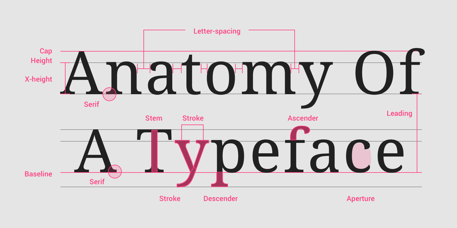
Typography Design
- The typeface (font-family).
- Type (modular) scale.
- Responsiveness of the text (size unit and breakpoints).
- Spacing and vertical rhythm.
- Colors (theming).
Refer to: font-family, font-size, spacing, color.
Typography Properties
Font Size
- Set a base-size.
- Multiples of base-size.
- Use
remfor most font-size, useemfor some spacing (needing responsive design). remis better.emfor responsive layout: e.g layer2 font based-on layer1 font in dropdown menu.- Make text legible: at least
16px.
$xs: $base / $ratio / $ratio;
$sm: $base / $ratio;
$md: $base;
$lg: $base * $ratio;
$xl: $base * $ratio * ratio;
Font Typeface
Prefer web fonts:
- Especially in headings, because of consistency.
- Keep it to 2 to 5 font files or below 100 kb.
- Use system fonts for body text or UI text, if you have to.
Spacing
Make text breathe:
margin/padding: at least15px.line-height:1.4.word-spacing.letter-spacing.- 60-100 characters per line.
Vertical Rhythms
Keep vertical spaces between elements on a page consistent (and relative) to each other:
- Set the vertical white space between elements to a multiple of base-size.
- Set the line-height of all text elements to a multiple of base-size.
- Set
margin-topandmargin-bottomto<h1>~<h6>/<hr>elements setmargin-bottomto normal elements.
Line Length
The optimal line length for body text is 50–75 characters:
- Shorter or longer line lengths can hurt readability.
.line-length {
  margin-top: 2em;
  line-height: 1.5em;
  word-spacing: 0.16em;
  letter-spacing: 0.12em;
}
Table Typography
- Remove fills, grid lines, border and bolding.
- Left-align text, right-align numbers and align headings with data.
- Put white space to work to group and separate.
Typography Reference
- Understanding typography guide.
- Practical typography guide.
- Golden rules of web typography reference.
- Typeface font matrix.
Responsive Design
- Mobile first:
@media only screen and (min-width: 768px). - Media query.
- Fluid layout.
- Flexible image.
Mobile Viewport
Disable mobile browser auto scale:
<meta name="viewport" content="width=device-width, initial-scale=1" />
Responsive Font
rem/emfont size.
Responsive Length
vw.vh.vmin:min(vw, vh).vmax:max(vw, vh).
Responsive Size
- Size in
emif the property scales according to it'sfont-size: e.g buttonpadding. - Modular font size:
Size in
emif thefont-sizeshould be modular (relative to it's context/parent). - Size everything else in
rem(include@mediaqueries).
/* scales to self font-size */
.container {
  margin-top: 1.2em;
}
/* modular font size */
.container {
  font-size: 1.2rem;
}

.container p {
  font-size: 1em;
}

.container small {
  font-size: 0.9em;
}
Responsive Box
Responsive Width and Height
min-height.max-height.min-width.max-width.
/* responsive images */
img {
  display: block;
  max-width: 100%;
}
Image display set to inline default.
Responsive Inline Box
use inline-box with width
.element {
  display: inline-block;
  width: 80%;
}
Responsive Flex Box
.box {
  display: flex;
  flex-wrap: wrap;
}

.box > .item {
  flex: 1;
}
Responsive Grid Box
.box {
  display: grid;
  grid-template-areas:
    'hd'
    'st1'
    '.'
    'st2'
    '.';
  grid-template-columns: 1fr;
}

@media only screen and (width >= 768px) {
  .box {
    grid-template-areas:
      'hd hd'
      'st1 .'
      '. st2';
    grid-template-columns: 1fr 1fr;
  }
}

@media only screen and (width >= 1280px) {
  .box {
    grid-template-areas:
      'hd hd hd'
      'st1 . st2'
      'st1 . st2';
    grid-template-columns: 1fr 1fr 1fr;
  }
}

@media only screen and (width >= 1536px) {
  .box {
    grid-template-areas:
      'hd st1 . st2'
      'hd st1 . st2';
    grid-template-columns: 20% 1fr 1fr 1fr;
  }
}
Responsive Image
.responsive-image {
  display: block;
  max-width: 100%;
  height: auto;
}
<picture>
  <source srcset="mdn-logo-wide.png" media="(min-width: 600px)" />
  <img src="mdn-logo-narrow.png" alt="MDN" />
</picture>

<img
  src="x-small.png"
  srcset="x-small.png 300w, small.png 400w, medium.png 600w, large.png 800w, x-large.png 1200w"
  sizes="
    (min-width: 70em) 12.6875em,
    (min-width: 50em) calc(25vw * 0.95 - 2.75em),
    (min-width: 35em) calc(95vw / 2 - 4.125em),
    calc(95vw - 1.375em)
  "
  alt="Dummy Image"
/>
Responsive Table
table {
  width: 100%;
}

@media (width <= 30em) {
  table,
  thead,
  tbody,
  tr,
  th,
  td {
    display: block;
  }

  tr {
    margin-bottom: 1em;
  }

  /* 隐藏表头 */
  thead tr {
    position: absolute;
    top: -9999px;
    left: -9999px;
  }
}
Design Systems
- OpenUI: W3C Community Group
- Design Systems Database
- Component Gallery: Components Collection from Best Design Systems
- Global Design System
- Logo System: Logo Design Library
Design Tokens
Design tokens are the atomic building blocks of a design system. Think of them as named containers that store your website’s visual DNA:
- Colors.
- Fonts.
- Spacing.
- Sizing
- And more.
Design Tokens Importance
- Consistency: A token like “brand-blue” with the value “#006699” ensures that exact blue is used everywhere. This extends to spacing, typography, and more.
- Maintainability: Update the token, and changes ripple through your entire application to complete a design refresh.
- Scalability: Design tokens keep your growing projects organized. New components inherit your design rules, guaranteeing a unified look.
- Collaboration: Tokens become a shared language between designers and developers, a single source of truth for your website’s style.
Design Tokens Implementation
Tiered structure: we define tokens at different levels of abstraction:
- Tier 1: Base value
(--color-brand-blue-800). - Tier 2: Semantic meaning
(--theme-color-content-default). - Tier 3: Component-specific use
(--theme-color-button-content).
<script>
// my-button.js
class MyButton extends HTMLElement {
// ... your component setup
connectedCallback() {
this.shadowRoot.innerHTML = `
`
}
// ... rest of your component code
}
customElements.define('my-button', MyButton)
</script>
<style>
/* Design tokens as CSS custom properties */
:root {
--color-brand-blue-800: #069; /* Tier 1 */
--theme-color-content-default: var(--color-brand-blue-800); /* Tier 2 */
--theme-color-button-content: var(--theme-color-content-default); /* Tier 3 */
}
</style>
Implementing design tokens in your workflow:
- Design Phase: Defining Visual DNA:
- Define your design tokens in a shared document.
- Use tools like Figma, Sketch, or Adobe XD to create a design system.
- Craft the core visual attributes: color palettes, typography, spacing and sizing.
- Define tokens hierarchical structure: this is where tokens become powerful.
- Exporting Phase: Generating Tokens:
- Use tools like Token Studio, Style Dictionary, or Figma Tokens to generate tokens.
- Export tokens in a format (
JSON/YAML) that can be consumed by your development environment. - Define a naming convention for your tokens.
- Take use of version control and continuous integration.
- Development Phase: Implementing Tokens:
- Create a CSS file to store your tokens.
- Use CSS custom properties to define your tokens.
- Implement tokens in your components.
- Component library integration: include the generated styles in your component library environment setup (e.g Storybook).
- Maintenance Phase: Updating Tokens:
- Regenerate tokens and update your CSS file: design systems aren’t static.
- Test your components to ensure the changes are applied correctly.
- Use version control to track changes.
CSS Design Tokens
:root {
  /* Fluid type scale core tokens */
  --size-step-minus-2: clamp(0.6944rem, 0.6376rem + 0.284vi, 0.84rem);
  --size-step-minus-1: clamp(0.8333rem, 0.7488rem + 0.4228vi, 1.05rem);
  --size-step-0: clamp(1rem, 0.878rem + 0.6098vi, 1.3125rem);
  --size-step-1: clamp(1.2rem, 1.028rem + 0.8598vi, 1.6406rem);
  --size-step-2: clamp(1.44rem, 1.2016rem + 1.1918vi, 2.0508rem);
  --size-step-3: clamp(1.728rem, 1.402rem + 1.6302vi, 2.5635rem);
  --size-step-4: clamp(2.0736rem, 1.6323rem + 2.2063vi, 3.2043rem);
  --size-step-5: clamp(2.4883rem, 1.8963rem + 2.9602vi, 4.0054rem);
  --size-step-6: clamp(2.986rem, 2.1974rem + 3.943vi, 5.0068rem);
  --size-step-7: clamp(3.5832rem, 2.5392rem + 5.2201vi, 6.2585rem);

  /* Fluid space scale core tokens */
  --space-3xs: clamp(0.25rem, 0.2256rem + 0.122vi, 0.3125rem);
  --space-2xs: clamp(0.5rem, 0.4268rem + 0.3659vi, 0.6875rem);
  --space-xs: clamp(0.75rem, 0.6524rem + 0.4878vi, 1rem);
  --space-s: clamp(1rem, 0.878rem + 0.6098vi, 1.3125rem);
  --space-m: clamp(1.5rem, 1.3049rem + 0.9756vi, 2rem);
  --space-l: clamp(2rem, 1.7561rem + 1.2195vi, 2.625rem);
  --space-xl: clamp(3rem, 2.6341rem + 1.8293vi, 3.9375rem);
  --space-2xl: clamp(4rem, 3.5122rem + 2.439vi, 5.25rem);
  --space-3xl: clamp(6rem, 5.2683rem + 3.6585vi, 7.875rem);

  /* Colors core tokens */
  --color-light: #fff;
  --color-light-shade: #f3f5f7;
  --color-dark: #000;
  --color-mid: #ebebeb;
  --color-mid-shade: #dedede;
  --color-midnight: #4a4e69;
  --color-midnight-shade: #22223b;
  --color-eggshell: #f2e9e4;
  --color-blue: #3b71fe;
  --color-blue-glare: #eef6fd;
  --color-slate: #4f5563;

  /* Abstract into more specific, semantic variables */
  --leading: 1.5;
  --leading-short: 1.3;
  --leading-fine: 1.1;
  --leading-flat: 1;
  --leading-loose: 1.7;
  --kerning: normal;
  --kerning-tight: -0.04ch;
  --kerning-loose: 0.1ch;
  --text-size-base: var(--size-step-0);
  --text-size-meta: var(--size-step-minus-1);
  --text-size-heading-1: var(--size-step-5);
  --text-size-heading-2: var(--size-step-4);
  --text-size-heading-3: var(--size-step-3);
  --text-size-heading-4: var(--size-step-2);
  --text-size-prose: var(--text-size-base);
  --space-gutter: var(--space-m);
  --space-gutter-s: var(--space-s);
  --space-gutter-l: var(--space-l);
  --space-regions: var(--space-xl);
  --size-wrapper-max-width: 1135px;
  --color-global-bg: var(--color-light);
  --color-global-text: var(--color-dark);
  --color-surface-bg: var(--color-mid);
  --color-surface-bg-interact: var(--color-mid-shade);
  --color-surface-text: var(--color-dark);
  --color-surface-text-interact: var(--color-dark);
  --font-base:
    -apple-system, 'BlinkMacSystemFont', avenir next, avenir, segoe ui, helvetica neue, helvetica, cantarell, ubuntu,
    roboto, noto, arial, sans-serif;
  --font-display: var(--font-base);
  --font-weight-regular: 400;
  --font-weight-medium: 500;
  --font-weight-bold: 700;
  --font-weight-black: 900;
  --focus-ring: 2px solid currentcolor;
  --focus-ring-offset: 2px;
}

body {
  font-family: var(--font-base);
  font-size: var(--text-size-base);
  line-height: var(--leading);
  color: var(--color-global-text);
  background: var(--color-global-bg);
}

.grid {
  display: grid;
  grid-template-columns: repeat(var(--grid-placement, auto-fill), minmax(var(--grid-min-item-size, 16rem), 1fr));
  gap: var(--space-gutter, var(--space-s-l));
}

.button {
  display: inline-flex;
  gap: var(--button-gap, var(--space-gutter));
  padding: var(--button-padding, 0.8em 1.5em);
  font-weight: var(--button-font-weight, var(--font-weight-medium));
  line-height: var(--button-leading, var(--leading-fine));
  color: var(--button-text, var(--color-surface-text));
  text-transform: var(--button-text-transform, uppercase);
  letter-spacing: var(--button-kerning, var(--kerning-loose));
  text-decoration: none;
  background: var(--button-bg, var(--color-surface-bg));
  border-radius: var(--button-radius, 0);
}

.button:hover {
  color: var(--button-interact-text, var(--color-surface-text-interact));
  background: var(--button-interact-bg, var(--color-surface-bg-interact));
}
React Design Variants
import type { ButtonHTMLAttributes } from 'react'

type ButtonVariant = 'filled' | 'outlined'

export type ButtonProps = {
  /**
   * the variant of the button to use
   * @default 'outlined'
   */
  variant?: ButtonVariant
} & ButtonHTMLAttributes<HTMLButtonElement>

const ButtonStyles: { [key in ButtonVariant]: React.CSSProperties } = {
  filled: {
    backgroundColor: 'blue', // Change this to your filled button color
    color: 'white',
  },
  outlined: {
    border: '2px solid blue', // Change this to your outlined button color
    backgroundColor: 'transparent',
    color: 'blue',
  },
}

export function Button({
  variant = 'outlined',
  children,
  style,
  ...rest
}: ButtonProps) {
  return (
    <button
      type="button"
      style={{
        ...ButtonStyles[variant],
        padding: '10px 20px',
        borderRadius: '5px',
        cursor: 'pointer',
        ...style,
      }}
      {...rest}
    >
      {children}
    </button>
  )
}
Design Tokens Naming Convention
- Naming best practices.
Design Principles
Cicada Principle
禅原则:
当用户注意到一个有辨识度的特征 (比如木纹上的节疤) 在以固定的规律循环重复时, 那它试图营造的自然随机性就会立刻崩塌. 使用 CSS 实现形状时, 应尽可能地重现大自然的随机性.
Fitts Law
费茨定律:
人机交互和人体工程学中人类活动的模型, 它预测了从任意位置快速移动到一个目标位置所需的时间, 由 2 个位置的距离(D)和目标大小(S)有关, 正比于 D, 反比于 S:
- 关联性强的 UI 放置在一起.
- 大拇指点击热区.
- 屏幕边界视为无限大 (容易到达).
- 关机滑动距离长.
- 利用透明边框或伪元素扩大可点击区域 (hit area).
米勒定律
人的短时记忆能力广度为 7±2 个信息块:
- 手机号/银行卡号/超大数字分段放置, 信息分层 e.g
134 9999 9999,999, 999, 999. - 文章布局时增大段落间 margin, 改变部分文字的粗细/字体/颜色.
- 导航/选项卡不超过 9 个 (超过 9 个可使用 dropdown/subMenu).
席克定律
用户所面临的选择数量越多, 做出选择所花费的时间就越长, 在人机交互的界面中选项越多, 意味着用户做出决策的时间越长:
- 减少选项并提供默认值.
- 分类分层.
- 分步分页 (大部分手机应用注册界面).
泰斯勒定律
泰斯勒定律又称复杂性守恒定律, 该定律认为每一个过程都有其固有的复杂性, 这个复杂性存在一个临界点, 超过了这个点就不能再简化了, 你只能将固有的复杂性从一个地方移动到另外一个地方:
- 智能手机: 按键的复杂度转为手机操作系统的复杂度.
- 智能推荐: 用户自己选择筛选条件的复杂度转为人工智能算法的复杂度.
Components Design
- UX Checklist
- Components Checklist
- Accordion
- Responsive Configurator
- DateTime Picker
- Feature Comparison Table
- Slider
- Birthday Picker
- Mega Dropdown
- Frozen Filter
- Disabled Button
- Infinite Scroll
- Breadcrumbs
- Push Notification
- Carousel
- Navigation
- Language Selector
- Data Visualization
- Pricing Page
- Authentication Page
- Back Button
- Error Message
- Inline Validation
- Pronouns Selector
- Mobile Apps
HomePage User Experience
UX research point out that:
- Feature a Broad Range of Product Types (6% Don’t).
- Avoid Overly Aggressive and Distracting Ads (59% Don’t).
- Implement Carousels Carefully (75% Don’t).
- Assist the Selection of a Well-Defined Scope (62% Don’t).
- Invest in Bespoke Imagery and Design (19% Don’t).
- Make the Search Field Immediately Obvious (22% Don’t).
- Implement Country & Language Selection Carefully (35% Don’t).
- Ensure Visual Hit Areas Match the Actual Hit Areas (43% Don’t).
NNGroup article homepage design principles:
- Ensure Easy Access to the Homepage:
- Ensure every page includes both implicit and explicit links to the homepage.
- Use a simple and predictable URL for your site.
- Signpost your homepage by making it visually distinct from other pages.
- Communicate Who You Are and What You Do:
- Display the company name and logo prominently in the top left corner of the homepage.
- Include a tagline that explicitly conveys what your site or company does.
- Emphasize the unique value your site brings to your users, as well as how it differentiates from competitors.
- Ensure that featured imagery accurately reflects your brand.
- Reveal Content Through Examples:
- Place the most important content above the fold, and lead users down the page when there is more content to see.
- Provide specific examples of your site's content.
- Prompt Actions and Navigation:
- Include clear, descriptive link labels that resonate with your users.
- Emphasize high-priority tasks with a clear visual hierarchy.
- Locate primary navigation in a highly noticeable place.
- Keep Homepages Simple:
- Opt for simple, standard homepage designs.
- Minimize motion and animation.
- Provide immediate access to content.
- Avoid popup windows and splash screens unless legally required.
Form Design
Buttons Placement
- Align the primary button to the left edge of the inputs.
- Put the back button above the form.
- Put tangentially related actions above the form.
- Place extra buttons based on what they do.
- In some single field forms put the button next to the input (e.g
searchbutton). - Put buttons on multi select forms above the form.
User Experience
High conversion rate can happen despite poor UX:
- Strong brand power.
- Aggressive urgency tactics.
- Attractive prices.
- Brilliant marketing.
- Historical customer loyalty.
- No alternative.
AI Interfaces
AI Interfaces Design Patterns
Design patterns for AI Interfaces:
- Input UX, expressing intent:
- Conversational AI is a very slow way of helping users express their intent.
- Instead of writing prompts manually, it’s a good idea to ask AI to write a prompt to feed itself.
- Output UX, displaying outcomes: AI output doesn’t have to be merely plain text or list. It must be helpful to drive people to insights, faster.
- Refinement UX, tweaking output: Allow users to refine the output of AI.
- AI Actions, tasks to complete: Allow users to initiate tasks that AI can perform on their behalf.
- AI Integration, where work happens: Integrate AI into the user’s workflow and daily used tools.