Background
Color
<color>:initialvaluetransparent.backgroundshorthand property:background-colorvalue only be included in last layer specified.
Image
url().image-set([<image> <resolution>]#).linear-gradient().radial-gradient().conic-gradient().- 语法越靠后的背景图像的层叠等级越低:
background一般设置为background-image# background-color.

.image-set {
  width: 128px;
  height: 96px;
  background: url('fallback.jpg');
  background: image-set(url('w128px.jpg') 1x, url('w256px.jpg') 2x, url('w512px.jpg') 3x);
  background-size: cover;
}
Repeat
.background-repeat {
  /* Keyword values */
  background-repeat: repeat-x;
  background-repeat: repeat-y;
  background-repeat: repeat;
  background-repeat: space;
  background-repeat: round;
  background-repeat: no-repeat;

  /* Two-value syntax: horizontal | vertical */
  background-repeat: repeat space;
  background-repeat: repeat repeat;
  background-repeat: round space;
  background-repeat: no-repeat round;
}
Position
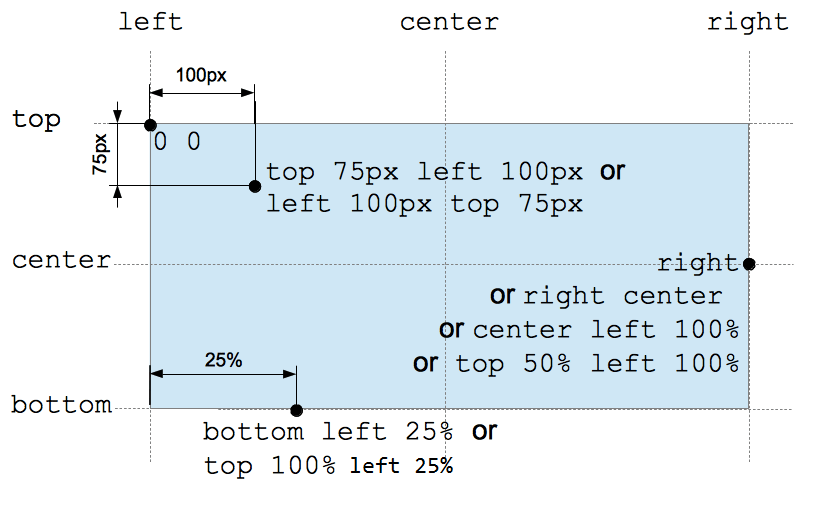
Percentage background position (<position> type):
- X offset value =
(container width - image width) * (position x%). - Y offset value =
(container height - image height) * (position y%).
/* Keyword values */
background-position: top;
background-position: bottom;
background-position: left;
background-position: right;
background-position: center;

/* <percentage> values */
background-position: 25% 75%;

/* <length> values */
background-position: 0 0;
background-position: 1cm 2cm;
background-position: 10ch 8em;

/* Multiple images */
background-position:
  0 0,
  center;

/* Edge offsets values */
background-position: bottom 10px right 20px;
background-position: right 3em bottom 10px;
background-position: bottom 10px right;
background-position: top right 10px;
Clip
指定背景显示范围:
border-box.padding-box: 虽然border层叠等级高于background, 但是透明边框在视觉上仍会被有色背景覆盖 (背景会延伸至边框下方). 设置background-clip: padding-box可用于保证border-color: transparent不被background-color: white视觉覆盖.content-box.text: 可用于实现渐变文字/镂空文字/背景蒙版文字.
@property --offset {
  syntax: '<length>';
  inherits: false;
  initial-value: 5px;
}

@keyframes move {
  to {
    --offset: 15px;
  }
}

p {
  color: #000;
}

/* 同心圆外扩动画 */
p:hover {
  color: transparent;
  background: repeating-radial-gradient(
    circle at 0 0,
    #000 calc(var(--offset) - 5px),
    #000 var(--offset),
    #fff var(--offset),
    #fff calc(var(--offset) + 5px)
  );
  background-clip: text; /* -webkit-background-clip: text; */
  animation: move 0.5s infinite linear;
}
可以利用多重背景实现 border-image:
background: linear-gradient(white, white) padding-box, var(--repeating-stripe-gradient),
语法靠前的 padding-box 白色背景处于高层, 遮住大部分条纹背景,
导致条纹背景只显示在 border 区域, 从而模拟实现 border-image 效果.
.stripe-border {
  padding: 1em;
  background:
    linear-gradient(white, white) padding-box,
    repeating-linear-gradient(
        -45deg,
        red 0,
        red 12.5%,
        transparent 0,
        transparent 25%,
        #58a 0,
        #58a 37.5%,
        transparent 0,
        transparent 50%
      )
      0 / 5em 5em;
  border: 1em solid transparent;
}
Origin
指定背景绘制起点:
padding-box.border-box.content-box.- 影响
background-size: <percentage>大小. - 影响
background-position定位. - 影响起点两侧背景样式细节.
Size
auto{1,2}:- 具有 intrinsic size 的背景 (e.g. 位图),
computed to
[intrinsic size, intrinsic size]. - 具有一个方向 intrinsic size, 具有 intrinsic ratio 的背景 (e.g. 矢量图),
computed to
[intrinsic size, intrinsic size * intrinsic ratio]. - 具有一个方向 intrinsic size, 不具有 intrinsic ratio 的背景 (e.g. 矢量图),
computed to
[intrinsic size, extrinsic size]. - 不具有 intrinsic size, 具有 intrinsic ratio 的背景 (e.g. 矢量图),
computed to
contain(等比例缩放). - 不具有 intrinsic size, 不具有 intrinsic ratio 的背景 (e.g. CSS gradient),
computed to
[extrinsic size, extrinsic size].
- 具有 intrinsic size 的背景 (e.g. 位图),
computed to
cover: 等比例裁剪, 部分图像会裁剪.contain: 等比例缩放, 部分区域会留白.<length-percentage>{1,2}:<percentage>: calculate by extrinsic size andbackground-originbox.
.background-size {
  background-size: cover;
  background-size: contain;
  background-size: 100%;
  background-size: 20px;
  background-size: auto 100%;
  background-size: auto 20px;
  background-size: 100% 100%;
  background-size: 20px 20px;
}

.video {
  min-width: 100%;
  min-height: 100%;
  overflow: hidden;
  background-size: cover;
}
Attachment
scroll: scrolls with main view, but stays fixed inside local view.local: scrolls both with main view and local view.fixed: stays fixed no matter what.
Scroll View
对于可以滚动的元素 (overflow: scroll):
- 当
background-attachment: scroll时, 背景图不会随元素内容的滚动而滚动 (fixed inside local view). - 当
background-attachment: local时, 背景图会随元素内容的滚动而滚动 (scroll with local view).
滚动阴影:
/**
 * 纯白渐变背景随列表滚动而滚动, 灰度渐变背景不随列表滚动而滚动.
 * 列表滚动时, 纯白渐变背景移出视口, 露出灰度渐变背景.
 */
.scrollable-list {
  background: linear-gradient(#fff 30%, transparent), radial-gradient(at 50% 0, rgb(0 0 0 / 20%), transparent 70%);
  background-repeat: no-repeat;
  background-attachment: local, scroll;
  background-size:
    100% 50px,
    100% 15px;
}
Parallax
Implement scroll parallax effect background-attachment: fixed:
/* parallax effect */
body {
  box-sizing: border-box;
  width: 100%;
  height: 100vh;
  padding: 0;
  margin: 0;
}

.parallax {
  min-height: 60%; /* key */
  background-image: url('./images/bg.jpg');
  background-repeat: no-repeat;
  background-attachment: fixed; /* key */
  background-position: center;
  background-size: cover;
}