Gradient
Color Stop List
<color-stop-list>,
[<linear-color-stop> [, <linear-color-hint>]?]#, <linear-color-stop>:
<linear-color-stop>:<color> <length-percentage>{1,2}?.<linear-color-hint>:<length-percentage>, 改变颜色的转换点位置.<length-percentage>:<length> | <percentage>.
<angular-color-stop-list>,
[<angular-color-stop> [, <angular-color-hint>]?]#, <angular-color-stop>:
<angular-color-stop>:<color> && <angle-percentage>{1,2}?.<angular-color-hint>:<angle-percentage>, 改变颜色的转换点位置.<angle-percentage>:<angle> | <percentage>.
Color Stop Position
若后一个色标的位置值为 0,
则它的位置总是会被浏览器调整为前一个色标的位置值:
/* 条纹形状 */
.stripe {
  background: linear-gradient(yellow 30%, blue 0);
  background: linear-gradient(yellow 33.3%, blue 0 66.6%, yellowgreen 0);
  background-size: 100% 45px;
}
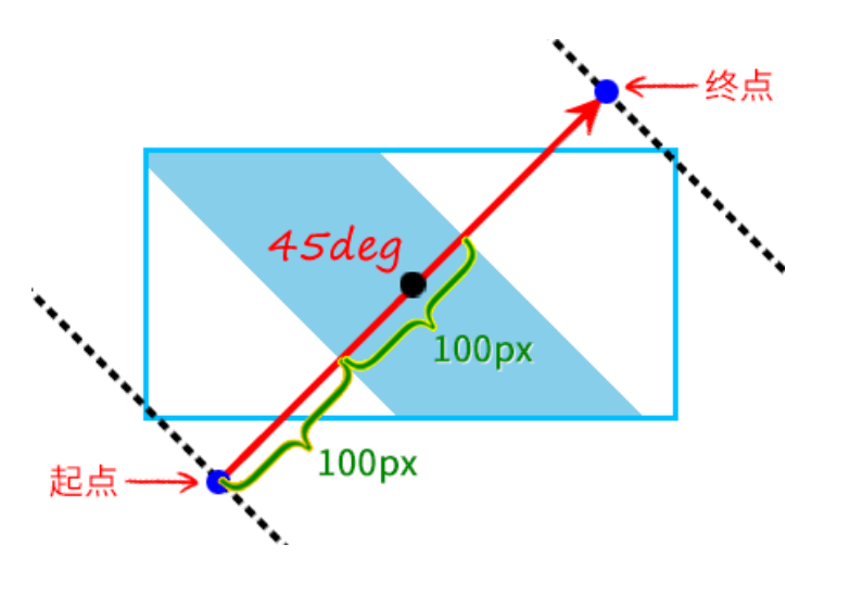
Linear
[<angle> | to <side-or-corner>]?, <color-stop-list>.- Default angle:
to bottom. 0degangle:to top.90degangle:to right.-90degangle:to left.
.linear-gradient {
  width: 300px;
  height: 150px;
  background-image: linear-gradient(45deg, white 100px, skyblue 100px 200px, white 200px);
  border: solid deepskyblue;
}
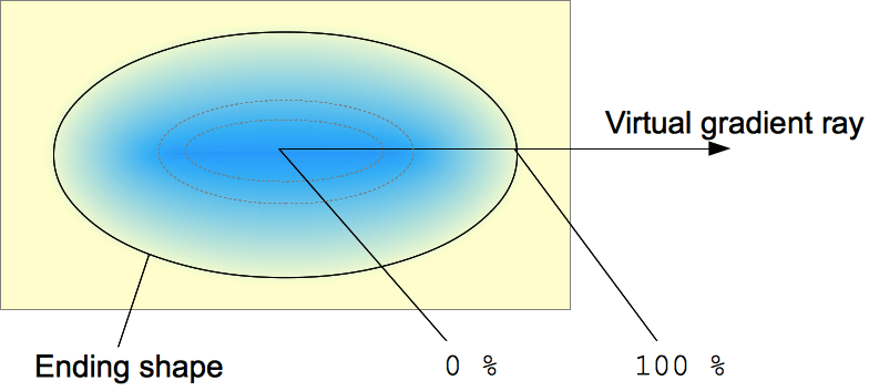
Radial
[<ending-shape> || <size>]? [at <position>]?, <color-stop-list>.<ending-shape>:ellipse(initial value).circle.
<size>.closest-side.farthest-side.closest-corner.farthest-corner.<length>: 单独一个值不能为<percentage>.<length-percentage>{2}.
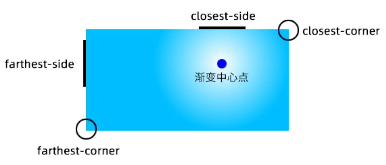
.radial-gradient {
  background-image: radial-gradient(50px, white, deepskyblue);
  /* stylelint-disable-next-line declaration-property-value-no-unknown */
  background-image: radial-gradient(50px 50%, white, deepskyblue);
  /* stylelint-disable-next-line declaration-property-value-no-unknown */
  background-image: radial-gradient(50% 50%, white, deepskyblue);
  background-image: radial-gradient(100px at 0 0, white, deepskyblue);
  background-image: radial-gradient(100px at left top, white, deepskyblue);
  background-image: radial-gradient(100px at right 100px bottom 100px, white, deepskyblue);
  background-image: radial-gradient(farthest-corner circle at right 100px bottom 100px, white, deepskyblue);
}
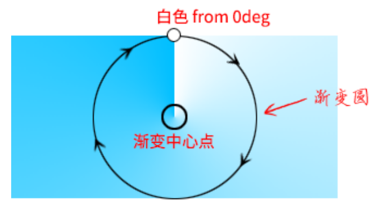
Conic
[from <angle>]? [at <position>]?, <angular-color-stop-list>.- Default angle:
0deg.
.pie {
  width: 150px;
  height: 150px;
  background: conic-gradient(yellowgreen 40%, gold 0deg 75%, deepskyblue 0deg);
  border-radius: 50%;
}

.color-picker-wheel {
  width: 150px;
  height: 150px;
  background:
    radial-gradient(closest-side circle, gray, transparent), conic-gradient(red, magenta, blue, aqua, lime, yellow, red);
  border-radius: 50%;
}
References
- Background gradient loading spinner.
- Background gradient shapes.