Mask
mask:
- 元素应用
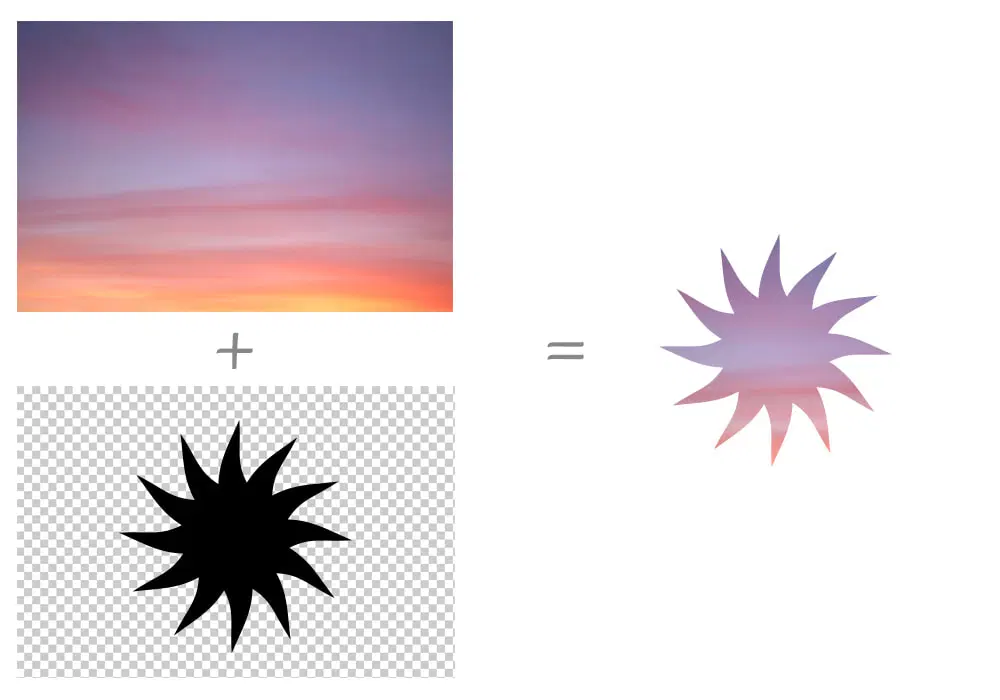
mask属性遮罩效果后, 透明部分仍然可以响应点击事件.
Image
none.<url>#.<gradient>#.<image()>.<image-set()>.<paint()>.<element()>.<cross-fade()>.
Mode
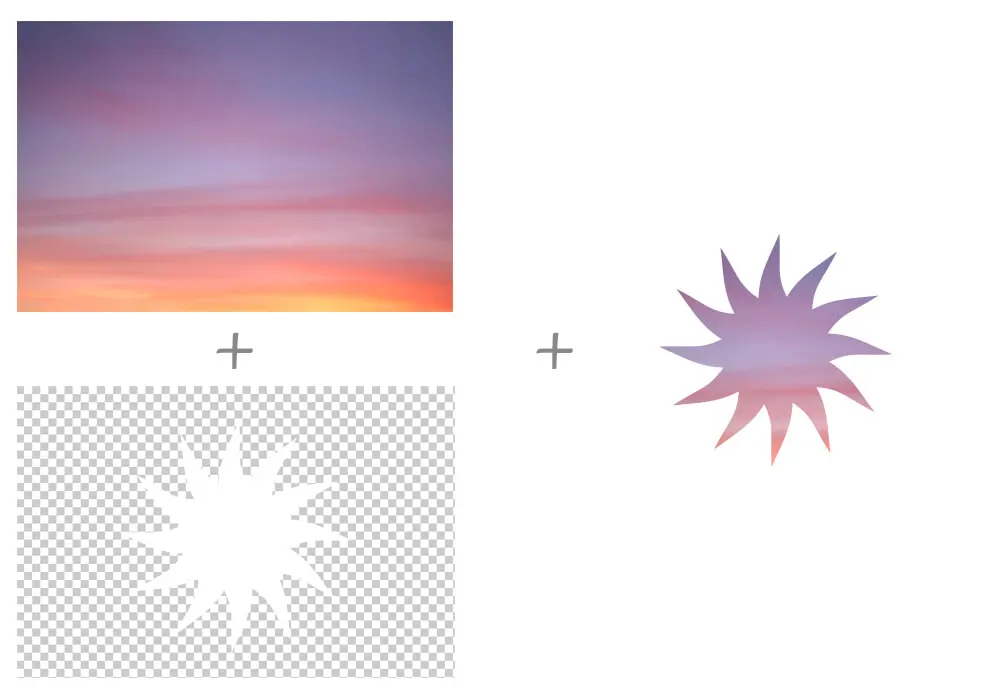
match-source: 根据mask-image类型自动选择模式, SVG<mask>元素 (url(#mask-id)) 为luminance模式, 其余场景 (包括url('mask.svg')) 为alpha模式.alpha: 基于透明度进行遮罩,alpha(100%)for show,transparentfor hidden.luminance: 基于亮度进行遮罩,alpha(100%)且为亮色 for show,alpha(100%)且为暗色 for hidden,transparentfor hidden.
img.alpha-mask {
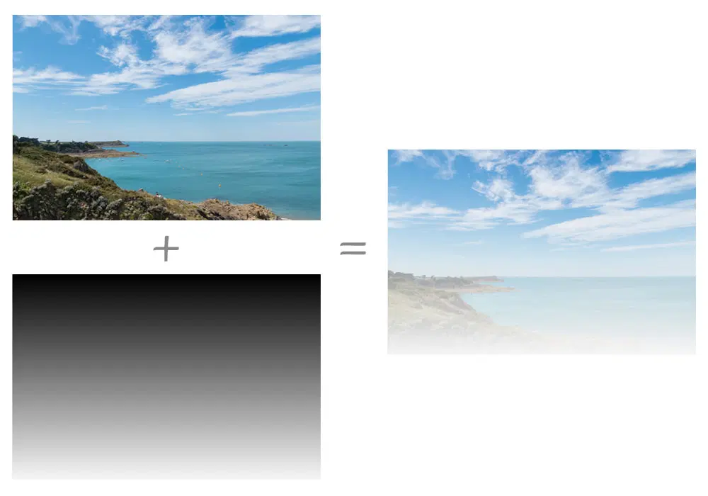
mask-image: linear-gradient(black, transparent);
mask-mode: alpha;
}
Type
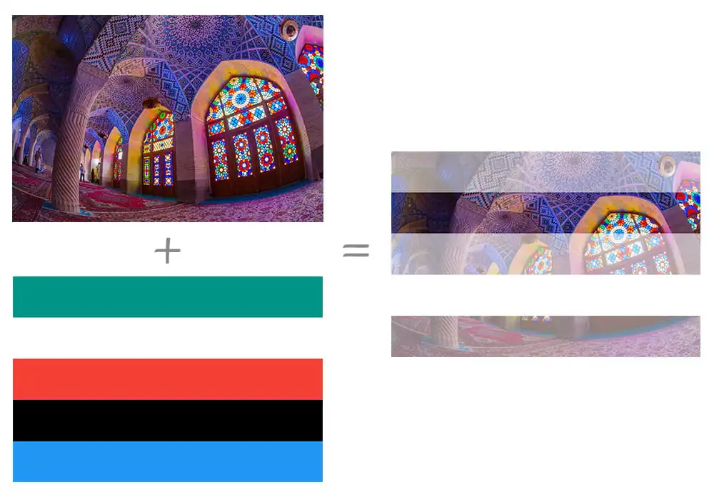
mask-type,
用于设置 SVG <mask> 元素的遮罩模式:
luminance.mask.
Repeat
| Single Value | Two Value Equivalent |
|---|---|
no-repeat | no-repeat no-repeat |
repeat-x | repeat no-repeat |
repeat-y | no-repeat repeat |
repeat | repeat repeat |
space | space space |
round | round round |
Position
.mask-position {
  /* Keyword values */
  mask-position: center;
  mask-position: top right;
  mask-position: bottom left;

  /* <length-percentage> values */
  mask-position: 25% 75%;
  mask-position: 0 0;
  mask-position: 10% 8em;
}
Clip
border-box.padding-box.content-box.margin-box.fill-box.stroke-box.view-box.no-clip.
Origin
border-box.padding-box.content-box.margin-box.fill-box.stroke-box.view-box.
Size
auto{1,2}.cover.contain.<length-percentage>{12}.
Composite
add: 所有遮罩图片直接合成一个完整的遮罩.subtract: 顶层遮罩图片中, 与底层遮罩图片重合的区域不显示遮罩.intersect: 顶层遮罩图片中, 与底层遮罩图片重合的区域才显示遮罩.exclude: 遮罩图片重合的区域被当作透明区域 (transparent), 其余区域直接合成一个完整的遮罩 (add).mask-image中语法越靠后的遮罩图片层叠等级越低.
.masked {
  width: 100px;
  height: 100px;
  background-color: #8cffa0;
  mask-image:
    url('https://mdn.mozillademos.org/files/12668/MDN.svg'), url('https://mdn.mozillademos.org/files/12676/star.svg');
  mask-size: 100% 100%;
  mask-composite: add;
}