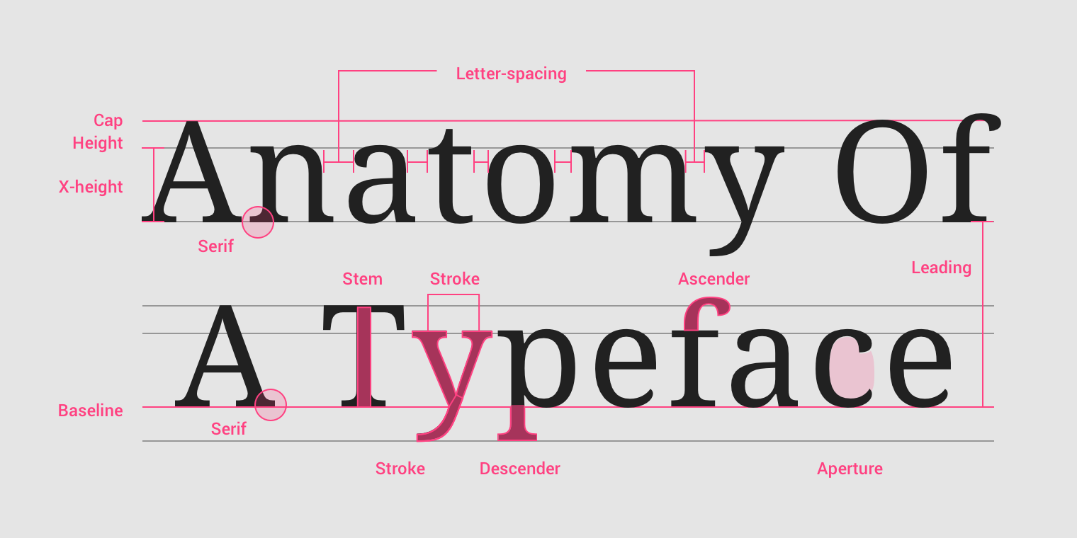
Typography
- The typeface (font-family).
- Type (modular) scale.
- Responsiveness of the text (size unit and breakpoints).
- Spacing and vertical rhythm.
- Colors (theming).
Refer to: font-family, font-size, spacing, color.
Size
- Set a base-size.
- Multiples of base-size.
- Use
remfor most font-size, useemfor some spacing (needing responsive design). remis better.emfor responsive layout: e.g. layer2 font based-on layer1 font in dropdown menu.- Make text legible: at least
16px.
$xs: $base / $ratio / $ratio;
$sm: $base / $ratio;
$md: $base;
$lg: $base * $ratio;
$xl: $base * $ratio * ratio;
Typeface
Prefer web fonts:
- Especially in headings, because of consistency.
- Keep it to 2 to 5 font files or below 100 kb.
- Use system fonts for body text or UI text, if you have to.
Spacing
Make text breathe:
margin/padding: at least15px.line-height:1.4.word-spacing.letter-spacing.- 60-100 characters per line.
Vertical Rhythms
Keep vertical spaces between elements on a page consistent (and relative) to each other:
- Set the vertical white space between elements to a multiple of base-size.
- Set the line-height of all text elements to a multiple of base-size.
- Set
margin-topandmargin-bottomto<h1>~<h6>/<hr>elements setmargin-bottomto normal elements.
Line Length
The optimal line length for body text is 50–75 characters:
- Shorter or longer line lengths can hurt readability.
.line-length {
  margin-top: 2em;
  line-height: 1.5em;
  word-spacing: 0.16em;
  letter-spacing: 0.12em;
}
Table
- Remove fills, grid lines, border and bolding.
- Left-align text, right-align numbers and align headings with data.
- Put white space to work to group and separate.
References
- Understanding typography guide.
- Practical typography guide.
- Golden rules of web typography reference.
- Typeface font matrix.